Posted by
Abram
In:
Where is everyone?
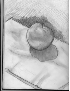
Common people comment!!! HOw do I know what your thinking if you don't comment!! THnk you for the people who do your feedback is very much appreciated. Heress an apple I drew today I hope you like the out come. I will post one of my works earlier that day in class. Then the good one I did at home. PLEASE COMMENT :)


This entry was posted on 7:54 p.m.
You can follow any responses to this entry through
the RSS 2.0 feed.
You can leave a response,
or trackback from your own site.
Posted on
-
9 Comments
Subscribe to:
Post Comments (Atom)

9 comments:
i was tempted not to comment just cause you asked for it so bad..buuut i feel like commenting. so: the top one is better cause its nice and dark/light. contrast! i drew mine..and my apple had a bruise. then groen told me to /not/ draw an apple with a bruise. pfft!
yea honestly don't ask for comments thats just not the blogger way.
everyone loves getting them, its pretty much unspoken though.
but since you drew something i'll comment. your top apple is definitely better than the other one. how long did you work on that? you could give it a bit more attention, but its looking pretty good.
someone sounds desperate...
the first one has some kind of perspective problem and the cast shadow is wrong. the top apple is definately better though, more contrast, less visible pencil markings. good.
and yes, you can't ask for the comments, just let them come. it'll feel much cooler when you get like a kajillion comments you didn't ask for anyway.
this is true
HAHAH phil and jonathan make me laugh.
"the first one has some kind of perspective problem and the cast shadow is wrong."
"you could give it a bit more attention"
aahahah-this should tell you a bit of what they do best;)
gj abram
definitely sound desperate. it's the unwritten rule not to remark on your number of comments... not to ask for any and not to complain about how many you got.
if you ask for comments you'll get something like this:
"Hey look! it's an apple!"
- there you go :P. how's that for you!
nice work abram. i'd say the top one's a huge improvement considering i watched you make the bottom one.
wow, your bottom one sucks. not that my apples have been good. i drew one in pastel, i think that i'll put it up and you guys can compare it to abrams.
Post a Comment